Kirby's Blog
Tuesday, January 8, 2013
Tuesday, December 11, 2012
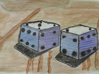
Game Drawing Perspective
This project wasn't that hard, but it required thinking and paying attention to little details within the drawing you needed to create. It was a fairly successful piece for me because i thought i implemented the use of perspective to create 3D shapes on a regular sheet of 2D paper. What worked for me was the dice; they were easy to create and looked appealing to the eye in the end. However, the floor didn't work. It didn't come out the way I had expected so kind of downplayed the rest of the picture. If I did this project again, I would spend more time on the background(the floor) in the picture. I learned more about perspective and how to draw better 3D shapes through this project. Using vanishing points and shadows, I was able to make good looking dice. Colored pencils and watercolor was used to color the picture. First, we painted with waterpaints, then we came back over that paint with colored pencil to add highlights and establish value within the certain region.
Monday, November 19, 2012
Glass anamorphisis
In the lab, we picked a picture and had to copy it to photoshop. There, we changed the height by using the transform feature, and changed the width by using the perspective tool. It would look different to the viewer because of the way it has changed in height and width. The person wouldn't recognize it as a distortion, but as a new picture that they haven't seen before. The most important concepts were creating the shadows and implementing the use of colors (colored pencils) in the product to make it look more 3-D. The grid helped us make an accurate copy and accurate shadow of the picture. In the product, the correct values had to be put in the correct places to make it look good. We had to use anamorphisis in the end to make it look 3-D.
Liberty Bell Stencil
To create this stencil, we took a picture and applied the threshold filter in photoshop. This created a deep contrast between the darks and lights, that would help us later on in the project. We then chose to cut out the black or white parts in the picture, then used the Xacto knife to cut it out. Following the cutting out, we spray painted the picture, and a product like the one above was made. I chose my backround because of the color and view. I took random pieces of books and magazines and glued them to the cardboard, creating a collage. After the pieces were glued on, I painted it over the collage with green paint. I knew that I was already going to spray paint the stencil black, so I figured that turquoise would be a good contrast color in the final product. In my stencil, the positive space represented the part that we cut out, in my case the Liberty Bell. The negative space was everything around it that wasn't cut out. Using the Xacto knife wasn't very hard, but some precautions such as not cutting towards your own hand and making sure it doesn't slip when your cutting came in the way of creating the stencil. Some people got hurt by the Xacto blades, but most people were fine and followed common sense safety precautions. Spray painting was a fun experience, it is easier than painting with a brush, and in some cases looks better in a final product. Spray paint makes it easier to create patterns within the painting. I chose black on turquoise for my background, because I have seen the color contrast in other places, and thought that it looked particularly good.
Monday, October 22, 2012
I thought that my project had great composition. There was a good balance between lights and darks in the print. The colors I used complemented each other and made the picture visually appealing. I used the hair onthe wombot as a way to create texture. I created a balance of darks and lights and also selectively put colors in different places to add contrast. The contrast and texture help make the picture look more visually appealing and more life-like, which is always important when creating a print of something such as a wombat. I created positive and negative space by cutting out certain parts of the lino cut, and leaving others to create dark/light positive/negative space. I thought it was crafted with skill, considering the difficulty of drawing the different textures and parts of the wombat. Yes I was able to achieve depth, but I think the fore-ground was something I should of spent more time on. The obstacles of printmaking were getting around certain lines and certain areas that were small and needed to be cut. The advantages were gaining more depth and texture in a final art project, and also making the picture look more life-like.
Subscribe to:
Posts (Atom)


